Greenplum - Big Data Analysis with SQL and Python

This article is the first part of the “Greenplum for End-to-End Data Science & ML” blog series, which covers how to use Greenplum’s Integrated In-Database Analytics functions to tackle data science projects from experimentation to massive deployment.
The Growth, Challenge, and Opportunity of Data
We are in the digital age, and everything we do with our smartphones, tablets, computers, and even household appliances produces an enormous amount and variety of data. While this may sound exciting, collecting data for the sake of having more data is not a meaningful exercise or a productive one. We need to understand what user goals or business outcomes might benefit from this data and invest the time and effort to extract value from the data. And this is where data scientists come into the picture.
How Data Scientists Might Help
Among all fields related to data, data science is a field of study that leverages data and quantitative modelling to build meaningful outcomes for users. The data scientist engages in a wide range of activities in this context, including but not limited to the following:
- Partnering with designers to build empathy with users to understand their needs and explore how we might use data and algorithms to delight them
- Prioritise what to build next with product managers.
- Collaborate with data engineers on identifying and preparing data for analysis.
- Explore data and build machine models to serve user needs — most commonly coding in Python, R, or SQL.
- Integrate with software engineers to deploy models as services to be consumed by applications or directly by users.
- Iteratively repeat (1)-(5) to continuous drive value for users
Focus for this Series: Technical Approaches & Tools to Extract value from Big Data
The activities listed above include aspects related to how data scientists work (e.g., user-centred, lean, agile) and also the tools & technologies needed to be most productive. We focus this technical blog series on the tooling component primarily related to (4) in the list above.
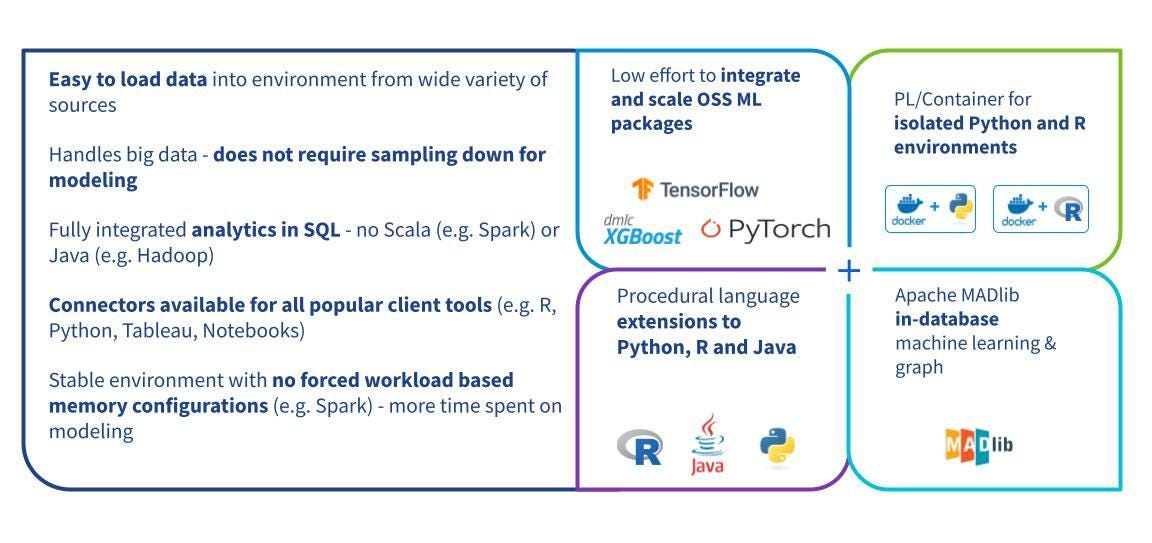
Specifically, we explore scenarios where the data scientist explores data and builds machine-learning models with a massive set of data. In this context, the data scientist may encounter particular technical challenges, including the following:
- Slow data science pipeline with large data volumes
- Hitting the ceilings of memory and computing in traditional Python/R runtimes
- Limited analytical functionality in platforms that enable big data computing
This series of technical blog posts addresses these challenges, focusing on **VMware Greenplum** as a critical enabling technology.
Why Greenplum?
Exporting data from a database and importing it into a server or desktop environment with commonly used tools for data science (e.g. Python, R) is not an ideal workflow for big data analytics. As described above, data scientists may need help with these tools' memory and scalability limitations and restrictive bottlenecks associated with transferring large amounts of data between different platforms.
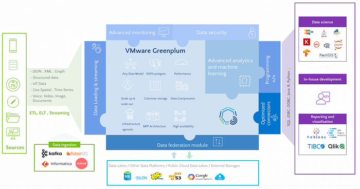
This is where leveraging the right tool becomes an important decision for the data scientist. In this post, we focus on Greenplum, a massively parallel processing PostgreSQL engine which provides built-in tools for data scientists for high-scale data exploration and model training. These tools and extensions include:
- ***Apache MADlib*** for machine learning
- ***Procedural language extensions*** to massively parallelise Python & R
- ***PostGIS*** for geospatial analytics and ***GPText*** for text search and processing
- Interoperability with dashboarding tools such as Tableau, PowerBI…
In this post, we describe how to start with Greenplum and share examples of how a data scientist might use the abovementioned tools.
Part 1: Setup and connectivity
- Install packages:
!pip install ipython-sql pandas numpy sqlalchemy plotly-express sql_magic pgspecial
2. Import packages:
import pandas as pd
import numpy as np
import os
import sys
import plotly_express as px
# For DB Connection
from sqlalchemy import create_engine
import psycopg2
import pandas.io.sql as psql
import sql_magic
3. Greenplum Database Connectivity:
There are several ways to establish a connection to Greenplum. With a Jupyter notebook, one can use SQL magic. This allows running SQL queries in a Jupyter cell.
- Installation on the client:
!pip install ipython-sql
For use at the notebook level, it suffices to establish the connection:
% load_ext _ sql
% sql postgresql://<user>:<password>@<IP_address>:<port>/<database_name>
Then run the SQL commands in a cell like this:
%% sql
SELECT version ();

You can also use the psycopg2 connector or pyodbc (there are also other options via JDBC, for instance)
Part 2: Dataset Overview
In this blog series, a **Daily Financial News for stocks** dataset from Kaggle with Licence CC0: Public Domain has been selected for use. We will use Greenplum and follow the data science cycle (Data Exploration — Data Preparation — Data Modelling — Model Evaluation — Model Deployment) to train an NLP model to process Sentimental Analysis for news.
The dataset contains Raw headlines from Benzinga.com and its partners. Its size is augmented up to around four million rows, which is quite an extensive dataset for manipulation, and it has seven columns:
- docid — integer: index unique
- title — text: headline of Row
- content — text: equivalent to the title
- url — text: link related to News
- publisher — text: News publisher
- date — date: publish date
- stock — text: stock tickers symbol related to News
To begin with this dataset, we will process an Exploratory Data Analysis with SQL command, including Greenplum Functions, without using other extensions (which will be discovered in the following blogs of the series).
Part 3: Data Preparation
The dataset is saved in the table source_financial_news. Let's take a look at one row of this table:
%%sql
SELECT * FROM source_financial_news LIMIT 1;

How many rows it contains precisely:
%%sql
SELECT count(*) FROM source_financial_news;

Partitioned table for better analytical performance
Since old news won’t be used frequently, let’s create a table ds_demo.financial_news partitioned by datewhere we are interested only in News published after 2010.
Setting the distributed key to the unique index docid allows data to be distributed equitably across different segments.
Moreover, setting storage to column-oriented and appendoptimized to True improves the analytical performance overall.
%%sql
DROP TABLE IF EXISTS ds_demo.financial_news;
CREATE TABLE ds_demo.financial_news
(
    LIKE source_financial_news
)
WITH (appendoptimized=true, orientation=column)
DISTRIBUTED BY(docid)
PARTITION BY RANGE (date)
(
    START (date '2010-01-01') INCLUSIVE
    END (date '2024-01-01') EXCLUSIVE
    EVERY (INTERVAL '1 month'),
    DEFAULT PARTITION old_news
);

-- Insert data from the source table into a newly created partitioned table
INSERT INTO ds_demo.financial_news SELECT * FROM source_financial_news;
Thanks to command \d+, a description of the newly created Analytical table is shown below:
%sql \d+ ds_demo.financial_news
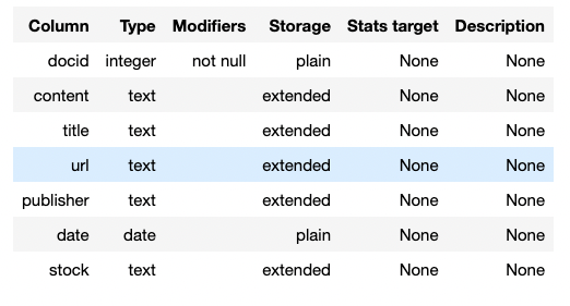
Note: With Greenplum 7, partitions don’t need to follow the same settings, and users can customise them according to their needs.
Check that our table is evenly distributed
Now our new table has been created, let’s check its distribution by calculating the standard deviation of the number of rows per segment.
%%sql
-- Standard deviation to check table distribution
SELECT STDDEV(count)
FROM (
    SELECT gp_segment_id, COUNT(*)
    FROM ds_demo.financial_news
    GROUP BY 1
) table_distribution ;

The standard deviation score is low (399.5784) compared to the mean 163383.333. Our table is evenly distributed!
Partitions to scan only needed data
With Partitions, there is no need to scan the older partitions at all to answer the query below.
%%sql
-- Show the execution plan "EXPLAIN" and check scanned partitions
EXPLAIN SELECT COUNT(*)
        FROM ds_demo.financial_news
          WHERE date >= '2020-01-01'::date
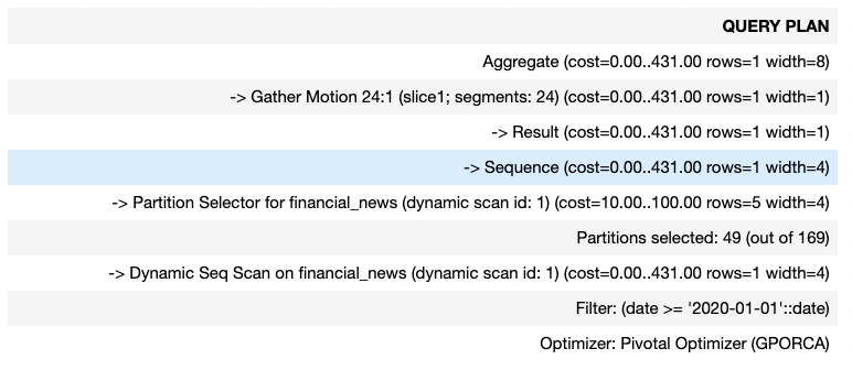
Furthermore, if we add a superior condition sup_date on date, there is no need to scan partitions with date superior to sup_date
Part 4: Exploratory Data Analysis with SQL & MADlib
After preparing our ds_demo.financial_news table, we will use SQL (sqlmagic for interactive results with the Greenplum database) and MADlib, an open-source SQL-based library for scalable in-database analytics.
It provides data-parallel implementations of mathematical, statistical, graph and machine learning methods for structured and unstructured data.
1. Another overview of the first two rows of Table
%%sql
SELECT * FROM ds_demo.financial_news LIMIT 2 ;

2. Apache MADlib for robust and powerful statistics using SQL
- Make sure that the MADlib extension is enabled!
%sql SELECT madlib.version();

2.1. Statistical description of the table — MADlib
MADlib’s summary() function produces summary statistics for any data table. The function invokes various methods from the MADlib library to provide the data overview.
%%sql
DROP TABLE IF EXISTS ds_demo.financial_news_summary;
SELECT * FROM madlib.summary(
        'ds_demo.financial_news', 'ds_demo.financial_news_summary'
);

The output of the function summary() is saved in the table ds_demo.financial_news_summary.
%%sql
SELECT
    target_column, distinct_values, missing_values, blank_values,
    min, max, mean, median, variance, most_frequent_values
FROM ds_demo.financial_news_summary;

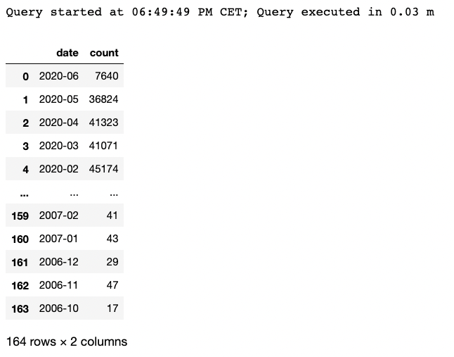
3. Number of news per date
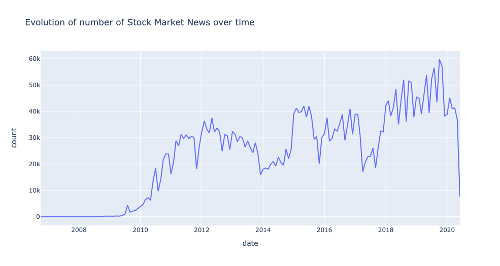
To see the evolution of the number of news over the months:
- Firstly, convert the date column into Year-Month format using the to_char SQL function.
- Then, group by the formatted date and calculate the frequencies using COUNT(*)
- Order final results based on the date.
%%read_sql df_news_per_date SELECT to_char(date,'YYYY-MM') as date, COUNT(*) FROM ds_demo.financial_news WHERE date IS NOT NULL GROUP BY 1 ORDER BY 1 DESC;
Let’s now visualise the aggregated results using Plotly:
px.line(df_news_per_date,
        x = 'date',
        y = 'count',
        title='Evolution of number of Stock Market News over time')
4. Histogram of Financial News Length
Visualise the distribution of stock market news length:
%%read_sql df_histogram
WITH drb_stats AS (
    SELECT min(length(title)) AS min,
           max(length(title)) AS max
      FROM ds_demo.financial_news
),
     histogram AS (
   SELECT width_bucket(length(title), min, max, 10) AS bucket,
          int4range(MIN(length(title)), MAX(length(title)), '[]') AS range,
          COUNT(*) AS freq
     FROM ds_demo.financial_news, drb_stats
     GROUP BY bucket
     ORDER BY bucket
)

SELECT bucket, range, freq,
        repeat('■',
               (   freq::FLOAT
                 / MAX(freq) OVER()
                 * 30
               )::INT
        ) AS bar
FROM histogram
ORDER BY bucket ASC
;
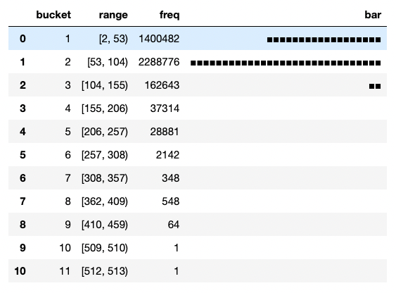
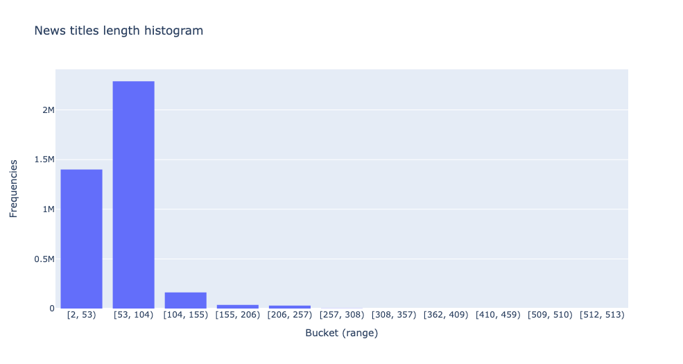
fig = px.histogram(y = df_histogram.freq,
                   x = df_histogram.range.astype(str),
                   nbins=10,
                   title = 'News titles length histogram')
fig.update_layout(yaxis_title="Frequencies", xaxis_title = 'Bucket (range)')
fig.show()
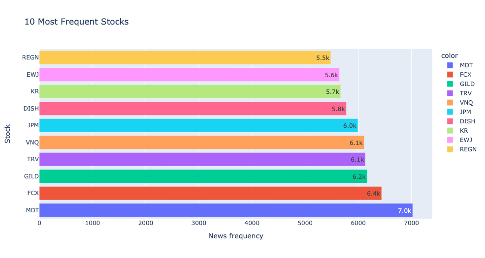
5. Number of news per stock
Use MADlib summary results to visualise the most frequent stocks.
%%read_sql df_stock_frequencies
SELECT most_frequent_values, mfv_frequencies
FROM ds_demo.financial_news_summary
  WHERE target_column = 'stock';

px.bar(y = df_stock_frequencies.most_frequent_values.values[0],
       x = df_stock_frequencies.mfv_frequencies.values[0],
       color = df_stock_frequencies.most_frequent_values.values[0],
       labels={'x':'News frequency', 'y': 'Stock'},text_auto='.2s',
       title="10 Most Frequent Stocks")
6. Number of news per publisher (source)
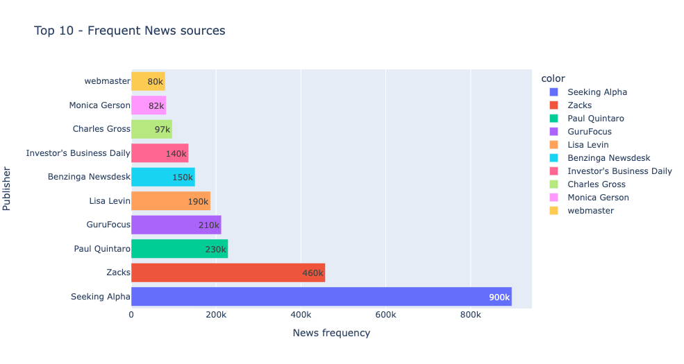
Let’s find the most dominant publishers in our dataset:
%%read_sql df_publisher_frequencies
SELECT most_frequent_values, mfv_frequencies
FROM ds_demo.financial_news_summary
  WHERE target_column = 'publisher';

px.bar(y = df_publisher_frequencies.most_frequent_values.values[0],
       x = df_publisher_frequencies.mfv_frequencies.values[0],
       color = df_publisher_frequencies.most_frequent_values.values[0],
       labels={'x':'News frequency', 'y': 'Publisher'},text_auto='.2s',
       title="Top 10 - Frequent News sources")
7. Which website is most present in our dataset?
%%read_sql df_url_domain
SELECT
        split_part(REGEXP_REPLACE(url, '^(https?://)?(www\.)?', ''), '/', 1) AS source_url,
        count(*) as frequency
FROM (SELECT
        CASE WHEN url IS NOT NULL THEN url ELSE 'Other' END
        AS url
      FROM ds_demo.financial_news
      ) t
GROUP BY 1
ORDER BY 2 ASC;
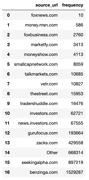
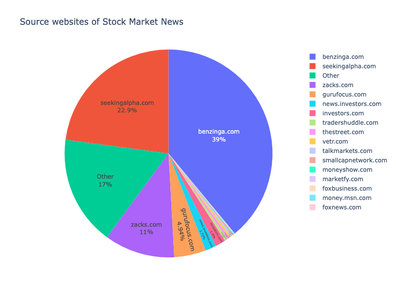
fig = px.pie(df_url_domain,
             names = 'source_url', values = 'frequency',
             width=800, height=600,
             title='Source websites of Stock Market News')

fig.update_traces(textposition='inside', textinfo='percent+label')
fig.show()
Conclusion
To conclude, Data Analysts & Scientists can unleash Greenplum performance and massively parallel processing capabilities to process and explore large datasets using built-in analytics functions by combining SQL & Apache MADlib and visualising the results using Python.
In a later blog, we will discover how Greenplum enables Advanced Text Analytics & Text Search by processing mass quantities of textual data using its GPText (Greenplum Text) solution.
Thanks for reading! Any comments or suggestions are welcome! Check out other Greenplum articles here.
